Vintage Colors Explained: Muted Shades That Feel Timeless
What are considered vintage colors?
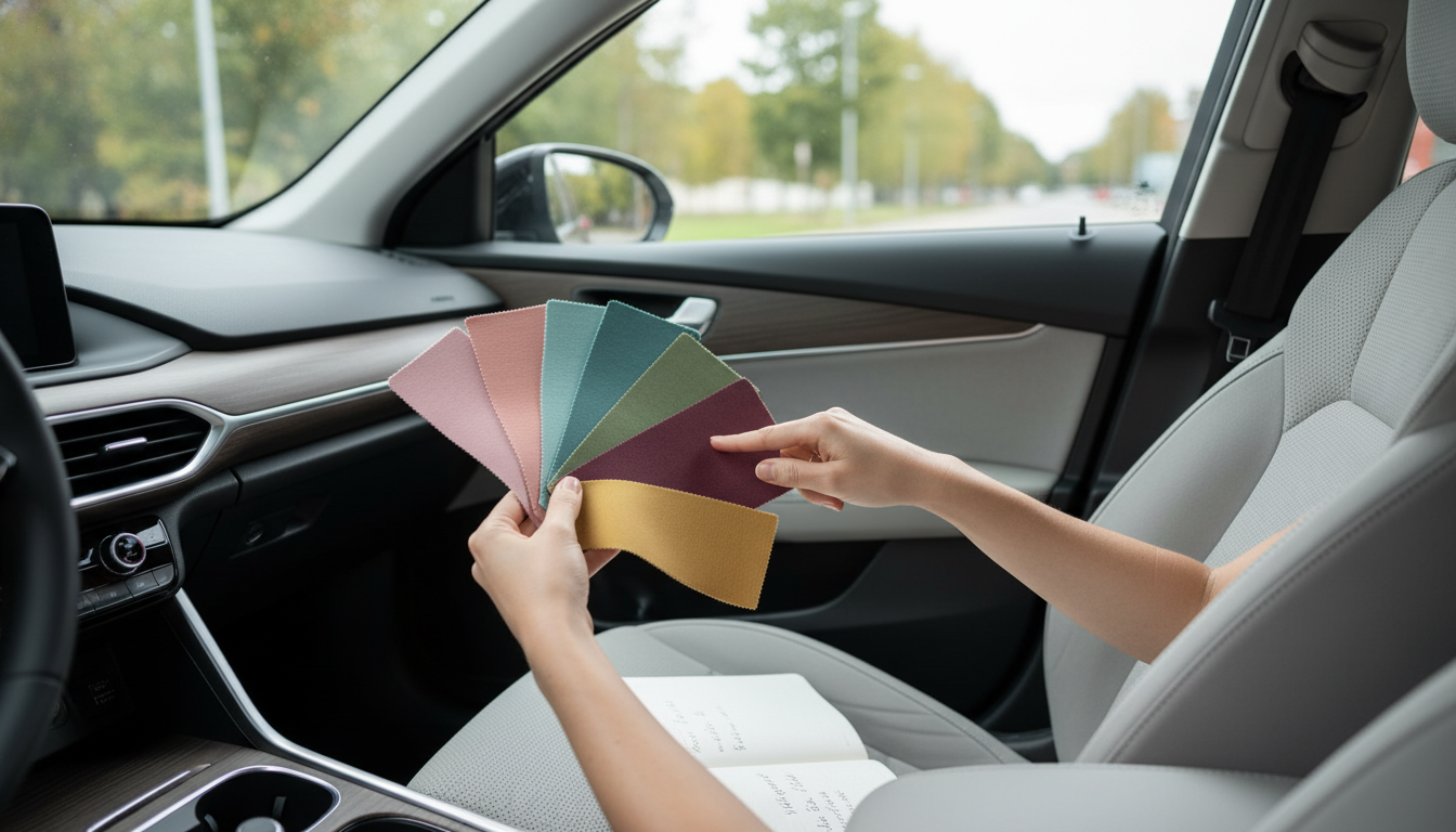
Vintage colors are shades that feel rooted in earlier design eras—often muted, softened, and slightly “aged” compared to modern, high-saturation brights. Instead of looking sharp or neon, they tend to appear dusty, warm, and lived-in, like pigments that have mellowed over time. Many vintage palettes also lean toward natural dyes and classic paint tones that were common in mid-century, cottage, farmhouse, and early industrial interiors.
Common vintage color families
Earthy neutrals are a staple: creamy ivory, warm beige, oatmeal, taupe, greige, and mushroom. These create a quiet backdrop that instantly reads as traditional rather than ultra-modern. Warm woods (walnut, honey oak, chestnut) often complement these tones and reinforce the vintage look.
Faded pastels are another hallmark. Think dusty rose, muted blush, powdery blue, washed lavender, and soft mint—colors that look more chalky than glossy. These shades are popular for small furniture and accents because they add character without dominating a room.
Moody heritage hues also qualify as vintage: olive and moss green, sage, mustard or ochre, brick red, terracotta, rust, deep teal, and navy. These are richer colors, but still typically appear toned down rather than overly bright.
What makes a color look “vintage” in a room
It’s not only the hue—it’s the finish and pairing. Matte, satin, or chalky finishes tend to read more vintage than high-gloss. Vintage colors also look most authentic when combined with classic materials like wood, metal hardware, woven textures, and simple silhouettes. Even a straightforward piece can feel vintage when its color is subdued and coordinated with warm neutrals.
Choosing vintage colors for a desk or workstation
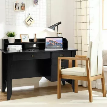
For home offices, vintage colors often work best when they balance comfort and clarity: a warm white or soft greige for brightness, paired with walnut or black hardware for contrast. If you want more personality, consider sage, dusty blue, or mustard accents through drawers, shelves, or accessories.
For more color ideas and combinations that fit a functional workspace, see the guide here: 4-color vintage desk with shelves and drawers.
FAQ
What colors go well with vintage wood furniture?
Warm whites, creamy beiges, sage green, dusty blue, and muted charcoal pair well with vintage wood because they complement natural grain while keeping the overall look soft and classic.








Leave a comment