Colors to Avoid for Your Skin Tone (Undertone + Contrast)
What Colors to Avoid for Your Skin Tone: An Easy Personal Style Checklist
Wearing the “wrong” color rarely looks truly bad—it usually just dulls the skin, emphasizes redness or shadows, or makes features look less defined. The goal is to spot the shades that fight your natural undertone and contrast level, then swap them for versions that flatter. Use the quick checks below to identify your undertone and contrast, followed by a simple avoid/choose checklist you can use while shopping or building outfits. For more guidance, see Determining Personal Colors | New Mexico State University.
Start with two variables: undertone and contrast
Undertone is the steady hue beneath the skin (warm, cool, neutral/olive). It influences whether yellow-based or blue-based colors look harmonious. If you want a quick science-backed overview of undertones and how to spot them, Cleveland Clinic’s guide is a solid reference: Skin Undertones: What They Are and How to Find Yours. For further reading, see How to Find The Best Colors to Wear For Your Skin Tone.
Contrast is how strongly your hair, eyes, and skin differ in lightness (low, medium, high). It influences how bold or muted colors should be. If undertone feels unclear, treat it as “neutral” and focus first on contrast and saturation (muted vs. bright). Color fundamentals like hue/value/chroma (helpful when comparing “bright” vs “soft” versions of the same shade) are explained clearly by Pantone’s color fundamentals and a broader overview is available via Britannica’s color theory.
Quick undertone checks (fast and practical)
- Jewelry test: gold often looks more seamless on warm undertones; silver often looks more seamless on cool undertones. If both work, neutral is likely.
- White vs. cream near the face: stark white can look crisp on cool undertones; creamy/ivory can look more natural on warm undertones. If both are fine, neutral/olive may be present.
- Blush reaction: if pinks turn “too rosy” quickly, warmth/olive may be present; if peach looks “orangey,” cool undertones may be present.
- Sun response isn’t definitive: many cool/neutral tones tan. But frequent surface redness can be amplified by certain warm oranges and bright yellows.
Color problems to watch for (the easy checklist)
- Washed out: the color is too close to your skin’s lightness or too muted for your contrast level.
- Sallow/gray cast: the color pushes the skin toward yellow-green (often happens with the wrong beige, khaki, or mustard).
- Redness emphasized: the color bounces extra pink/red onto the face (common with very warm reds on reactive skin, or very cool magentas on some warm/olive undertones).
- Harsh shadows: the color is too dark or too stark relative to your contrast (common with inky black on some warm/low-contrast looks).
- “Floating” effect: the color is too bright and clean when your coloring is softer/more muted, making the garment stand out more than your face.
Avoid vs. choose: undertone-based swaps
Think “same mood, better temperature.” You don’t need to abandon favorite colors—you usually just need a warmer, cooler, deeper, or softer version.
| Undertone | Often unflattering near the face | Try instead (similar vibe) |
|---|---|---|
| Warm | Icy lavender, baby blue, blue-based fuchsia, optic white | Cream/ivory, warm lilac, turquoise/teal, warm rose |
| Cool | Mustard, orange, camel, tomato red, yellow-beige | Charcoal/cool taupe, berry, blue-red, cool blush pink |
| Neutral | Extremes (very icy or very orange) if they overpower the face | Balanced mid-tones, “soft” versions of brights, medium neutrals |
| Olive | Some yellow-greens, flat khakis, overly warm beige, certain dusty oranges | Navy, emerald, burgundy, soft white, cocoa, slate |
Neutrals that can betray undertone (and what to buy instead)
- Beige isn’t one color: yellow-beige can turn some cool/olive skin sallow; pink-beige can look off on warm undertones. Search for labels like taupe, stone, mushroom, sand, or camel—and compare in daylight.
- Gray has temperature: warm undertones often prefer greige/charcoal over icy blue-gray; cool undertones often prefer true gray, charcoal, and crisp navy.
- White near the face is a big deal: warm undertones often shine in ivory/cream; cool undertones often shine in bright white. Neutral can wear either, but consistency helps an outfit look intentional.
- Brown can go orange or ashy: cool undertones may find some browns too orange; warm undertones may find some browns too ashy. Choose chocolate/espresso for depth, or a balanced cognac depending on your undertone.
Can warm skin tones wear black clothing?
What color dress is best for my skin tone?
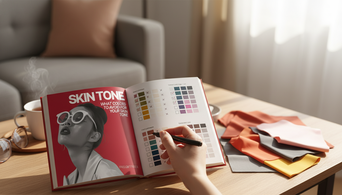
A simple shopping checklist (save this for later)
Downloadable checklist for a faster wardrobe edit
For a ready-to-use worksheet you can reference while shopping, use the What Colors to Avoid for Your Skin Tone checklist. It’s built for quick decisions: identify your “avoid near the face” shades, pick better neutrals, and lock in a small set of go-to flattering colors.
If you’re also building a more confident daily presentation (beyond color), these quick downloads can pair well with a wardrobe refresh: Confidence, Not Ego – Checklist and The Art of a Real Compliment.
FAQ
Can warm skin tones wear black clothing?
Yes, but black can look harsh near the face on warm/low-contrast coloring. If it adds shadows or dulls the skin, try espresso, warm charcoal, deep olive, or a slightly teal-leaning navy, or soften black with warm accessories and a lower neckline.
What color dress is best for my skin tone as a female?
Start by matching undertone: warm undertones often shine in coral, terracotta, teal, olive, and cream, while cool undertones often look clearest in blue-red, berry, cobalt, lavender, and crisp white. Then adjust saturation to your contrast level—softer coloring tends to prefer softer shades, and higher contrast can handle bolder color.


Leave a comment