Vintage Luxury Colors: Warm Neutrals, Jewels & Metals

What are the vintage luxury colors?
Vintage luxury colors are a curated set of rich, timeworn hues that feel refined rather than flashy. They’re inspired by old-world interiors, heritage fashion, and classic materials like leather, brass, walnut, and marble. The look is defined by depth, softness, and a slightly muted finish—colors that appear “lived-in” and expensive, even when used in small accents.
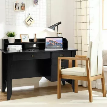
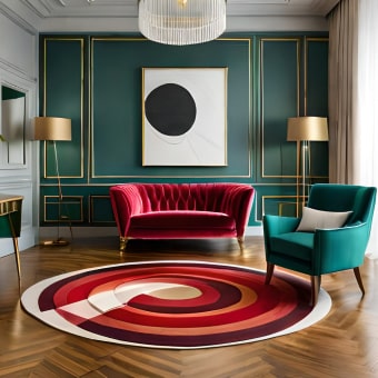
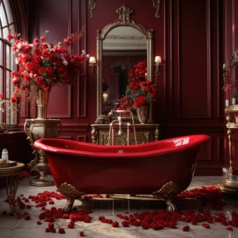
Common vintage luxury colors start with warm neutrals: ivory, cream, camel, taupe, and greige. These shades echo aged paper, linen, and natural stone, creating a quiet foundation that lets textures shine. On top of that base, deeper tones add drama without feeling loud—think chocolate brown, espresso, cognac, and oxblood.
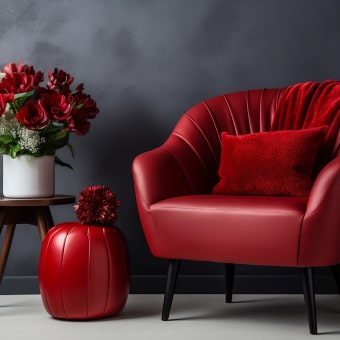
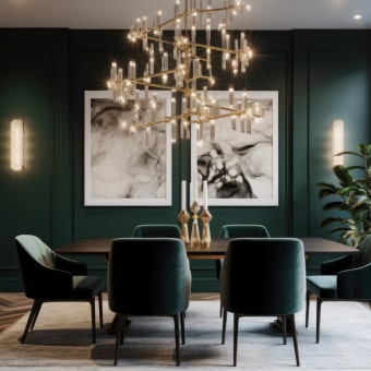
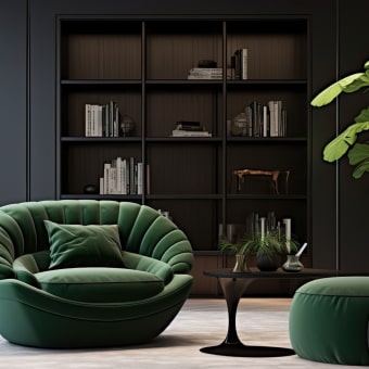
Jewel tones are another hallmark of vintage luxury, but they’re typically dialed down to feel classic: emerald green, sapphire/navy, garnet/burgundy, and amethyst/plum. These colors recall velvet upholstery, old library bindings, and eveningwear, especially when paired with matte fabrics, brushed metals, or antique finishes.
For a true vintage-luxury palette, balance is key: pair one deep statement color with layered neutrals and one metallic. Gold (especially antique or brushed), bronze, and brass read more vintage than bright chrome. Black can work, but softer versions—charcoal, ink, or near-black brown—often feel more authentically vintage.
Want a more detailed palette breakdown and styling ideas? Visit the full guide here: https://supremechoiceden.shop/blog/what-are-the-vintage-luxury-colors/.
For Vintage Luxury Colors: Warm Neutrals, Jewels & Metals, the best answer depends on fit, material, care instructions, and how the product will be used day to day.
FAQ
How do you combine vintage luxury colors without making a space feel dark?
Use light neutrals (ivory, warm beige, greige) as the main field color, then add depth with one darker tone (like navy or espresso) in smaller doses. Bring in warmth and lift through textures—linen, boucle, wood grain—and a restrained touch of antique brass or bronze.


Leave a comment