Best Vintage Colors: Muted Neutrals, Greens, Blues
What are the best vintage colors?
The best vintage colors are the ones that look slightly mellowed, lived-in, and timeless—shades that feel pulled from mid-century homes, old libraries, and well-loved workshops. Instead of bright, high-saturation tones, vintage palettes usually lean warm, dusty, or softly muted, which helps furniture and décor feel authentic rather than brand-new.
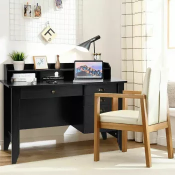
If you’re choosing a vintage color for a statement piece like a desk, aim for a hue that complements natural wood grain, brass or black hardware, and warm lighting. For a deeper dive into pairing color with a functional workspace piece, see the guide here: https://supremechoiceden.shop/guide-4-color-vintage-desk-with-shelves-and-drawers/.
1) Warm neutrals that age gracefully
Vintage spaces often start with creamy ivory, soft beige, oatmeal, and warm greige. These shades read “aged” even when freshly painted, and they highlight details like drawers, shelf trim, and curved edges. They’re especially strong if you want a cohesive look with mixed woods and older-style accessories.
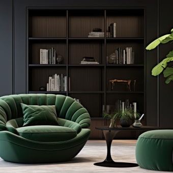
2) Earthy greens for a heritage feel
Sage, olive, moss, and muted eucalyptus are classic vintage-leaning greens. They evoke traditional study rooms and older cabinetry while still feeling calm and modern. Earthy greens pair well with walnut, oak, and darker stains—and they look great alongside brass pulls or antique-style knobs.
3) Dusty blues with a worn-in vibe
Think slate blue, faded navy, denim, and smoky periwinkle. These colors bring vintage character without overpowering a room. They work well on larger furniture because they hold visual weight, yet still feel softened when the undertone is gray or chalky.
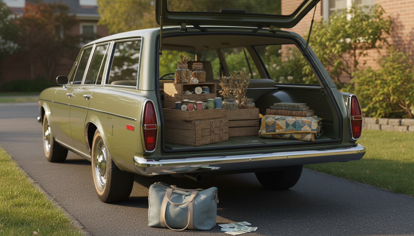
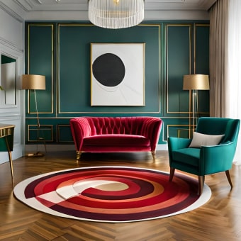
4) Muted reds and clay tones for warmth
Terracotta, brick, rust, and dusty rose nod to retro eras and add warmth fast. These shades look especially convincing in matte or eggshell finishes, where the color reads “patina-adjacent” rather than glossy and new.
5) Mustard and ochre for true retro energy
Mustard yellow, goldenrod, and ochre are bold vintage staples when used thoughtfully—often as an accent color or on a smaller surface. They pair best with warm woods, black metal, and neutral walls to keep the look balanced.
FAQ
How do you choose a vintage color that won’t feel too dark in a small room?
Pick a muted shade with a lighter value—like sage instead of forest green or dusty blue instead of navy—and use a matte finish to keep glare down while maintaining softness.


Leave a comment