60/30/10 Color Rule: How to Use It in Any Room

How to apply 60/30/10 rule?
The 60/30/10 rule is a simple way to balance color in a room so it feels intentional, not chaotic. It divides your palette into three parts: 60% dominant color, 30% secondary color, and 10% accent color. Here’s how to apply it step by step in a bedroom (or any space) without overthinking it.
Step 1: Choose your 60% dominant color
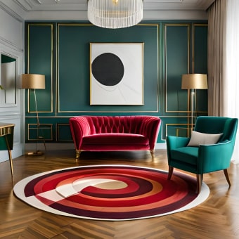
Your 60% is the backdrop. In most bedrooms, this is your wall color plus large visual areas like a rug, large bedding surfaces, or major furniture pieces. Neutrals (warm white, greige, soft taupe) are popular here because they’re easy to live with, but a muted color (sage, dusty blue) can work just as well if you keep it soft and consistent.
Step 2: Add a 30% secondary color for depth
The 30% supports the main color and adds contrast. Think: curtains, an upholstered headboard, a dresser, or bedding layers like a duvet and shams. The secondary shade should clearly differ from the 60% but still coordinate—either by staying in the same undertone family (warm with warm, cool with cool) or by using a toned-down complementary pairing.
Step 3: Finish with 10% accent color (or finish)
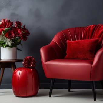
The last 10% is where the personality lives. Use it for throw pillows, a blanket at the foot of the bed, lampshades, wall art, a small bench cushion, or decorative objects. This can be a bolder color (terracotta, mustard, black) or a standout finish (brass, matte black) as long as it’s used sparingly and repeated at least twice to look cohesive.
Quick bedroom example
60% warm white walls + light bedding, 30% walnut furniture + beige curtains, 10% rust accents in pillows and art. The result feels layered, calm, and styled.
For more room-by-room guidance and planning tips, visit the full bedroom design guide here: https://supremechoiceden.shop/blog/guide-bedroom-design-ideas-every-style-planning-checklist/.
FAQ
What if I want to use more than three colors?
Keep the 60/30/10 structure, then treat additional colors as tiny sub-accents that “borrow” from the 10% portion so the room still reads as balanced.


Leave a comment